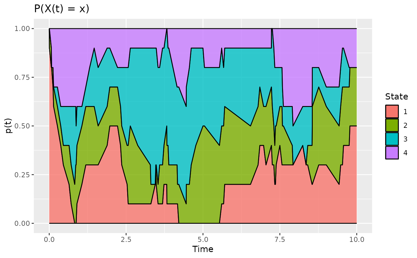
Plot the probabilities of each state at each given time
# S3 method for class 'pt'
plot(x, col = NULL, ribbon = FALSE, ...)
Arguments
- x
output of
estimate_pt- col
a vector containing color for each state
- ribbon
if TRUE, use ribbon to plot probabilities
- ...
only if
ribbon = TRUE, parameteraddBorder, if TRUE, add black border to the ribbons.
Value
a ggplot object that can be modified using ggplot2 package.
See also
Other Descriptive statistics:
boxplot.timeSpent(),
compute_duration(),
compute_number_jumps(),
compute_time_spent(),
estimate_pt(),
hist.duration(),
hist.njump(),
plotData(),
statetable(),
summary_cfd()
Examples
# Simulate the Jukes-Cantor model of nucleotide replacement
K <- 4
PJK <- matrix(1 / 3, nrow = K, ncol = K) - diag(rep(1 / 3, K))
lambda_PJK <- c(1, 1, 1, 1)
d_JK <- generate_Markov(n = 10, K = K, P = PJK, lambda = lambda_PJK, Tmax = 10)

d_JK2 <- cut_data(d_JK, 10)

pt <- estimate_pt(d_JK2)

plot(pt, ribbon = TRUE)